

Bronx Calling: The First AIM Biennial, Bronx Museum
If you're beginning an art career in the face of imminent economic meltdown, then clearly you've got something to say. Bronx Calling: The First AIM Biennial is now introducing a new generation of emerging artists who participated in the 2011 AIM (Artists in the Marketplace) Program. Often, perhaps unsurprisingly, the work is a little too reflective of a marketplace that tends to muddle passion and bastardize ideas. When forced to commercialize work, there is an inclination to forget that art can be profitable and genuine, provocative, even radical; I doubt early AIM alumnus Glenn Ligon considers racially-charged subject matter a marketable strategy, but it probably is. Hence, there is a need to discuss why, and how, many of the pieces in Bronx Calling hold on to their aim, while others lose their bearings.
The AIM Program, a twelve-week boot camp designed to advance the careers of emerging artists, is not entirely to blame. Rather than focusing on the content of the work, it simply provides much-needed resources, such as instruction in grant-writing, network-building, and legal rights. It has a strong track record: in addition to Ligon, previous participants have included Pheobe Washburn, Polly Apfelbaum, Rina Banerjee, Amy Cutler, and Anton Vidokle. The problem with its current exhibition, though, is that no end goal is specified beyond selling; this is surprising given the caliber, and often progressiveness, of its contributors.
Another major issue is the mysterious whereabouts of half of the show. Bronx Calling sprawls across two venues, miles apart: first at the Bronx Museum, then at Wave Hill, a garden estate on 252nd Street. The Bronx Museum mention of the Wave Hill portion does not appear on its exhibition splage page unless one scrolls to the bottom of its participating artist list and only briefly mentions it in its lengthy wall text. The museum receptionist only confessed to it after extensive interrogation, but also wasn't filled in on details (like the address).

Nicky Enright's "Inflammatory" at the Bronx Museum
The Bronx Museum show fills the lobby, galleries, and hallways with a smorgasbord of colorful works that fluctuate across a broad range of scale and media. Whatever the delights of variety, though, too many of the works rely on the sort of bland conceptualism that uses reasoning as a generative process, rather than an expressive tool. The result is an abundance of adequate metaphors, but rarely an impactful artwork. In one video, Nicky Enright shouts definitions of the word “inflammatory” in front of an enormous fire hose that spells “inflammatory”; it should say something, right? The audio not only drowns out Julia Oldham's adjacent video Antimatter Twin, but is layered so that it drowns out even itself. As if to reiterate [a point?], matchboxes with cartoon labels declaring “Rome was not BURNT in a day” fill a museum donation box on a pedestal. This work aspires to the ultimate Kosuthian hyperbolic oxymoron: he's talking about forceful language, three times over, in the most innocuous language possible, without saying anything forceful. The blunt jumbling of symbols, a repeatedly-used tactic throughout the show, fails to transcend the sum of its parts.

Centerpiece for Stella Ebner's "Die Hard Triptych" at the Bronx Museum
Tucked amongst the more dominant pieces are insightful, muted standouts such as Stella Ebner's scintillating and perceptive screen prints. Her Die Hard Triptych, hung in a corner near the end of the exhibition, depicts an Arctic Glacier ice freezer flanked by two empty video rental storefront windows. The words “LOWEST RATES IN TOWN” are repeatedly stamped across them, and TV screens inside display colorful action scenes from “Die Hard.” The reduction of the space to blaring logos and violent movie scenes is striking; the scene is familiar, but indications of place have been emptied out. Through minimal arrangements, the work achieves a deeply felt contemplation on obsolescence and solitude.

One of two bleachers: Jacob Rhodes's "Denim Dance" at the Bronx Museum
Much larger, but equally sensitive, is Jacob Rhodes's Denim Dance, a high school football stage set for homoerotic violence and rivalry. Two bleachers are angled toward each other, each shrouded with an embroidered denim quilt: the bleacher on the left is smashed, and the one on the right is covered with remnants from a catalogue of gay terms and definitions, as well as diagrams of button-down shirts. The quilts, which depict coupled men in jeans fistfighting, are intended to suggest evidence of an embroidering competition. In the background, a vertical wooden post with one arm about six feet from the ground displays a quilt with what may be abstracted shaving cream cylinders, arranged in a grid. Odd details make it real, and the tension between humor and drama grants us access to a psychological reality through fiction. Rhodes draws us into his imagination, but leaves enough open for us to use our own.

Glendalys Medina's "Caterpillar" at Wave Hill
The Wave Hill half of the show is worth the long trip: even without the backdrop of rolling hills and birdsong, the work here is more nuanced, if equally diplomatic. Glendalys Medina utilizes the location well in Caterpillar, part of a longer project which aims to “mine” “the aesthetics of urban culture.” A pair of PUMAs in a plexiglass case are partly submerged in the ground at the foot of an enormous tree. The absurdity of casting the brand name “PUMA” against the earth begets the realization that that, if not for the artist, these sneakers may have never touched soil. Wave Hill is technically part of the city, but New York is nowhere in sight; immediately one realizes the insularity of the city and the transience of urban culture.

Jenny Zhang's "Tarazo Sato-Spider" Series at Wave Hill
The caterpillar mini-theme continues with Jenny Zhang's suite of four prints that mix elementary-school diagrams of a moth's life with feminized photographs of a fawn-like young man, Tarazo. Educational statements hand-written in preteen calligraphy include “Eating and growing are what caterpillars do best”, “Tarazo was starting a non-profit and quitting his day job”, and “Beauty is shedding away layers of the past that were once debilitating.” Delicacy, beauty, and transformation are viewed here through the playful, educational objectification of a man, making clear our deeply-ingrained identification of these traits with females. White-robed Tarazo's beauty and vulnerability question whether we can yet view beauty and objectification without gender associations.
Next to Zang's prints are Meg Hitchcock's elaborately woven and utterly mesmerizing strands of religious and philosophical texts. Interlaced lines, cut letter-by-letter from the existentialist novel “Nausea,” form a noodley, plant-like structure that pushes against the edges of the paper and meanders upward. The minute text beckons the viewer to stand inches from the paper, but is too intricate to untangle, becoming expansive and overwhelming. Simply making something intricate is not particularly noteworthy, but here it aptly communicates.
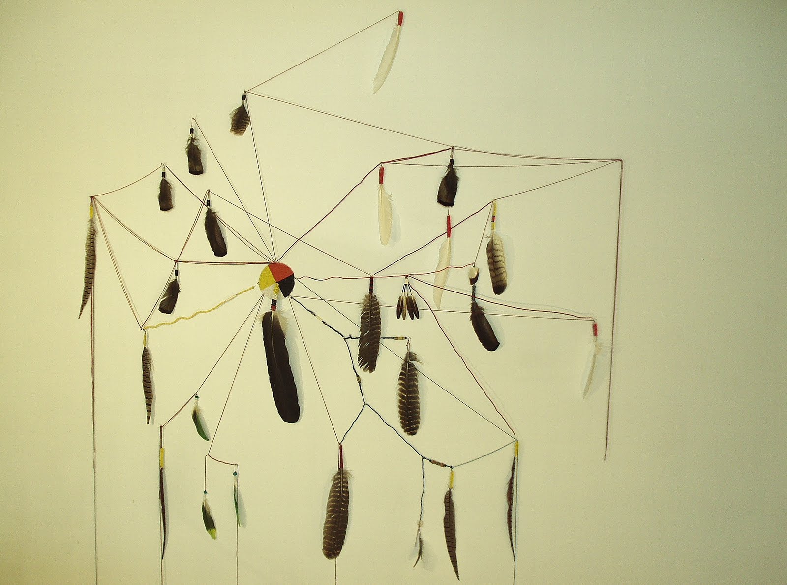
Over-marketing, however, is especially apparent throughout both shows, in wall texts that function like ad copy: uninsightful, unnecessary information that acts as selling points. Knowing that Randal Wilcox spits in his frenetic watercolor paintings does little to add to the electric vibrancy of his marks. Brian Scott Campbell's charcoal landscapes are already intriguing without the awareness that they're “partly inspired by J.G. Ballard novels.” The title Trail of Tears indicates depth in Dennis Redmoon Darkeem‘s strung-together feathers, but the work does not.
Aspiring to create a “professional” show is not necessarily a good thing. Professionalism implies a certain behavioral code that aims to please all and functions to smooth out conflict. Here, the works adhere to a neutering code that allows Gabriel J. Shuldiner to justify black monochrome paintings with nihilism, but proclaims that Erik Hougen must back up his massive, incredibly refined watercolor portraits by telling us they're about photographic reproduction processes. Maybe they are, but his devotion to rendering is far more interesting. It seems that if you just want to paint faces, admitting to that would be more compelling than making up an excuse. Aiming to please everyone gets us nowhere; if the work does not communicate, then the program is promoting a defunct product. The most successful pieces hold up without the sales pitch.
AFC’s Rating: 4/10 (Whitney Kimball)

{ 4 comments }
Thanks for covering Wave Hill, the historically fantastic and physically beautiful art & garden non-profit up in the Bronx. Did you know Darwin use to hang out there and the Queen of England too? And that the Kennedy’s had secret rum-running tunnels under the gardens? Anyway, but yeah, sorry Wave Hill’s gallery text was too much. Your line below stuck a note with me though:
“Over-marketing, however, is especially apparent throughout both shows, in wall texts that function like ad copy: uninsightful, unnecessary information that acts as selling points.”
I know from personal experience working there that their teeny tiny Marketing & Art departments mean well, but often miss the point and thus your statement is sadly valid… However to shine light, often the organizations Directors are just really out of touch with the contemporary art world. Since, well, most WH visitors and donors are elderly persons or families. The majority of which have little experience with art, esp. contemporary art, thus the bulk of WH’s audience is one that likes to be educated as to what they are looking at, why it has value, what’s context is, basically all the “unnecessary information that acts as selling points” that you mentioned.
Just wanted to throw that out there. As while I think your constructive feedback can help shape WH’s art program and the quality of the text they produce about their exhibits, they are also a unique space in the regard the non-profit is not strictly art-oriented. Thus WH has to carefully  balance curating art exhibits to a somewhat hostile population of grey-haired ladies who only like Degas and who come to WH only to see rose bushes. 😉
If one creates art with the goal selling it is just another product. One should create art with the goal of creating great art.
The goal of the AIM program is not how to sell your art. It is giving tips about being a professional artist and how to survive being one in NYC.
The exhibition was organized by two curators. I am one of them. I have to point out that there was significant direction given to the placement of artwork as well as a dialogue between the curators and the artists. Unfortunately the review does not acknowledge these efforts, though one is free to critique them. If the effect comes off as a trip through an institution’s marketing department, I suspect that this is a misguided inference that relies too much on the history of the AIM program as a also ran whose ostensible purpose is to turn artists into market fodder rather than as an exhibition proper. The curatorial function is not invisible. It is just not stated in the usual manner in which a grand theme is proposed or the purpose or function of the exhibition explicitly stated in a press release or wall text.  Â
Comments on this entry are closed.